12 Reel Cover Ideas For A Cohesive Grid
Messy grid? Not on our watch.

Let's be real—a messy Instagram grid is like showing up to a job interview in pajamas. Not a vibe.
If your Reels are serving killer content but your grid looks like digital chaos, we've got you. These Reel cover ideas are the secret weapon for brands looking to maintain that perfect aesthetic while still cashing in on video content's engagement power.
Why Reel Covers Matter For Your Brand
Your Instagram grid is prime real estate. It's often the first impression potential followers get when they land on your profile—and we all know what they say about first impressions.
Cohesive reel covers don't just look pretty (though they absolutely do). They:
Make your brand instantly recognizable
Elevate your perceived professionalism
Guide followers to your video content
Maintain your aesthetic even when you're posting dynamic content
Ready to transform those random video thumbnails into strategic brand assets? Keep scrolling for some killer reel cover ideas.
Reel Cover Ideas that Keep Your Grid Cohesive
1. Branded Color Blocks
Simple yet effective. Create covers with your brand colors as the background and add minimal text or your logo. This approach works beautifully if you want your grid to have that color story flow while still communicating what each Reel contains.
The magic here? Even without reading a word, followers will recognize your content just by the color palette. That's brand recognition at work.

2. Minimalist Text Overlays
For the "less is more" brands out there, try using clean, simple text on a neutral background. Think: one powerful statement or question that captures the essence of your Reel.
Keep the font consistent across all your covers—typography is a subtle but mighty branding element that creates cohesion without being obvious.

3. Templated Frames
One of our favorite reel cover ideas involves creating a consistent frame, text template, or border that appears consistently on your covers. Maybe it's a subtle corner element or a full-frame template that allows different images inside while maintaining that visual consistency.
This approach gives you flexibility with your content while still keeping that grid looking tight.

4. Split-Screen Product + Person
This cover style is perfect for product-based businesses. Create a split-screen with your product on one side and either yourself or a customer on the other. This humanizes your brand while keeping the focus on what you're selling.
The consistent split-screen format creates a rhythm across your grid that's super satisfying to scroll through.
5. Same Filter, Different Content
Sometimes consistency comes from treatment rather than content. Apply the same filter or color grading to all your reel covers while varying the actual images.
This approach allows total creative freedom with your Reels while ensuring your grid maintains that cohesive aesthetic everyone's double-tapping for.

6. Quote Highlights
Pull a standout quote or key takeaway from each Reel and feature it on your cover. Keep the background, font, and layout identical across all covers — just change the text.
This not only creates visual cohesion but also entices viewers to watch the full Reel to get the context behind that intriguing quote.

7. Branded Icons or Illustrations
Create a set of custom icons or illustrations that represent different Reel categories in your content strategy. Use the same background and placement for each, swapping only the central icon.
This approach works especially well for service-based businesses or educational content creators who cover multiple related topics.

8. The End-Frame Method
Instead of creating separate covers, strategically plan your Reels to end on a frame that works for your grid. This might mean ending with a specific pose, a text overlay, or a transition to your logo.
This method is genius because it feels natural within the Reel itself while still giving you that perfectly planned grid.
9. Season or Collection-Based Covers
For brands that shift offerings seasonally, consider themed reel cover ideas that change together. Maybe summer content gets a certain design treatment, while fall gets another — all within your brand guidelines.
This creates cohesion within seasons while still allowing your grid to evolve over time.

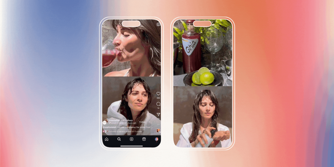
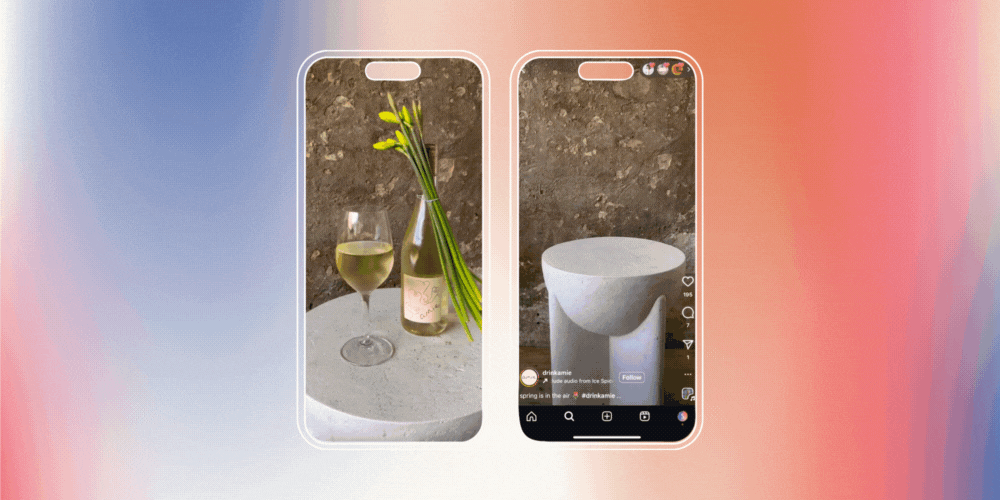
10. The Video Teaser Still
Select a single captivating frame from your Reel that genuinely represents the content while still looking visually aligned with your brand. The key is choosing moments that share visual elements—similar composition, lighting, or subject positioning.
This approach feels authentic because it uses actual content rather than created covers, but still maintains visual harmony.

11. Unused Photoshoot Selects
That gorgeous shot from your latest photoshoot that doesn't quite work as a grid post (or the one you've been staring at for 20 minutes trying to caption)? Give it the spotlight as a Reel cover instead!
Using these almost-perfect shots as Reel covers means:
Your photoshoot investment works harder for you
Your grid stays impeccably on-brand
That stunning visual doesn't collect digital dust in your camera roll
Add your signature frame or text overlay to keep it consistent with your other covers, and suddenly that "leftover" becomes a strategic brand asset. Talk about a glow-up.

12. Logo Watermark Consistency
Sometimes the simplest solutions work best. Add your logo in the same position on every cover, regardless of the background image. This creates an instant visual thread connecting all your Reels.
Pro tip: place your logo in a corner where it won't be covered by the Reels icon once posted.

How To Implement These Reel Cover Ideas
Ready to transform your grid? Here's how to get started:
Choose the approach that best aligns with your brand
Create templates using Canva or your preferred design tool
Stick with your system for at least 9-12 Reels to see the grid impact
Remember—the perfect Reel cover strategy balances aesthetics with information. Your covers should look beautiful together while still giving followers a clear idea of what content they'll get when they tap.
Reel Talk: Your Grid Deserves This Makeover
A cohesive grid is just one piece of your social media puzzle. The brands that truly stand out combine beautiful aesthetics with strategic content that connects with their audience.
At Scott Social, we take pride in creating social media strategies that marry metrics and aesthetics. We'd love to help transform your social presence into something that's not just pretty—but pretty effective too.
Ready to take your grid to the next level? Let's get social.
Read More from scott social↓


WRITTEN BY:
Halie Engler
Social Media Strategist + Copywriter